Long story short
Accell's eCommerce platform is built with Object-Oriented UX at its core and enhanced by a robust Design System. It scales efficiently using Design Tokens and a comprehensive brand configuration system, aiming to elevate the online presence and sales of its brands.
My role
Strategy Design Systems
Design + Execution
UI Engineering
Research
Company
Years
As part of the UX Design team, I took part in daily operations efforts to implement a Headless eCommerce platform. My role shifted from support to a more active one: filling the gap between designers and developers. While career wise my preferred choice would have been to be more of a UX generalist designer, due to capacity, I had to focus on design systems. As much as work-life balance allowed, I took challenges and tasks in evangelizing and practicing the Object Oriented UX framework. Also took some great joy in conducting a competitive analysis regarding keywords used in the main navigation.
Disciplines involved (A-Z)
Branding — Content — CRM — Design — Development — Marketing — SEO
The Challenge
Our small team needed to be successful implementing the proof of concept of a Headless eCommerce Platform*. In addition we had to consolidate relationships with the teams responsible for managing brands. Our challenge was to evolve with customers demands and enter the highly competitive directly to consumer market. It had to be good, fast and at a low cost.
* Designed in house and developed with an external agency.
User story
As an owner of multiple brands
I want to have a single platform to handle all the online shops
So that all brands can go directly to customer and expand into international markets.
Why B2C?
- Online to accelerate growth — reduces the complexity of launching and maintaining more than one brand.
- Cost effective — removing the middleman means companies can experiment with branding and get to market quicker.
- Speed — direct interaction allows to collect data and address issues without intermediaries in an agile manner to benefit both business and consumers.
- Brand visibility — improves customer experience by providing more relevant content.
A Test-and-Learn
Approach
Given the diversity of brands and their specific target audiences we needed to offer different solutions using the same code to showcase content.
Think of it this way: it’s nearly impossible for teams to be the best at everything, so we needed a way to align our priorities and focus on delivering the best possible experience in the areas that matter the most to our users.
User Experience is about how it works when a person comes in contact with it and creating one takes continuous effort.
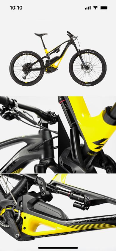
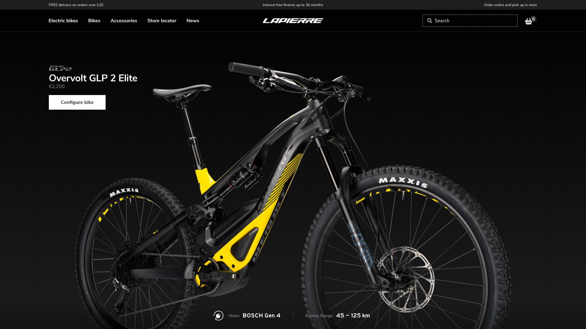
Less is more: We focused on designing and implementing best e-commerce practices, consolidated by UX research and UI patterns while working within cross functional teams. The storefronts of Raleigh and Lapierre are mobile-first scalable, fast, and optimized for conversions. This gives you complete control over the customer's experience in systems that can easily evolve, yet remain consistent.
We achieved this with:
- Scaling design systems
- Best design practices
- Easy shopping experience
- Headless eCommerce Platform
Customer
Insights
Rating
Qualitative data
Based on quality data and marketing reports, customers faced recurring challenges when purchasing bikes online. We needed to address behavior, motivations and test outcome:
- Which bike is right for me?
- What frame should I choose?
- What's my size?
- What specifications should my bike have?
- Where can I test it?
- During the pandemic the most important question became:
What bikes are in stock?
What We Knew
Slow pace decision: It can take customers from 6 to 8 months to decide to purchase a new bike.
Test before buy: They would prefer to test it before purchase.
This meant that our online store also needed to offer great support for dealers. Some brands even refused to have an online shop and used the platform solely to help the customer be informed about collections, relying on dealers to make sells.
Sport vs. Lifestyle
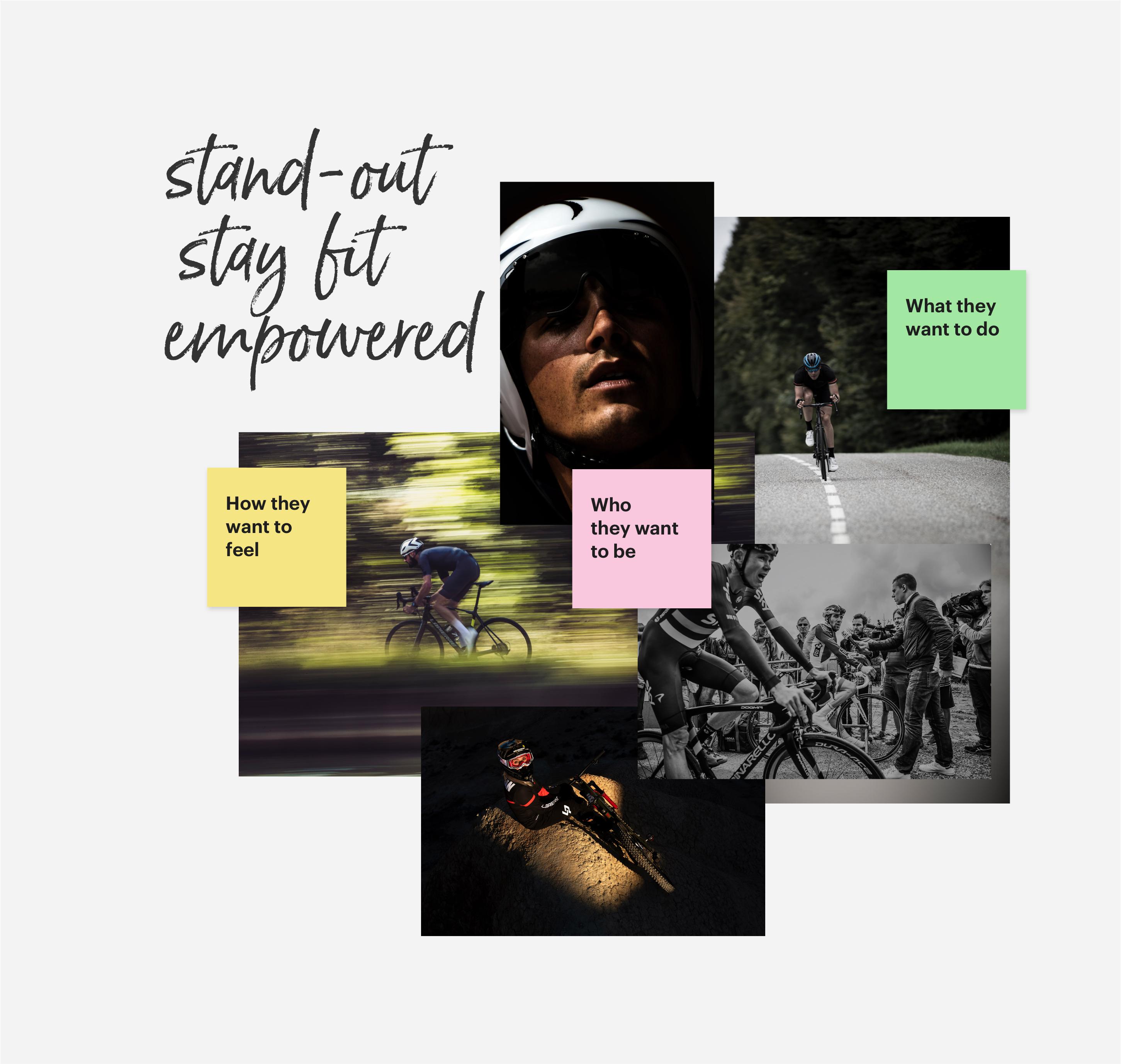
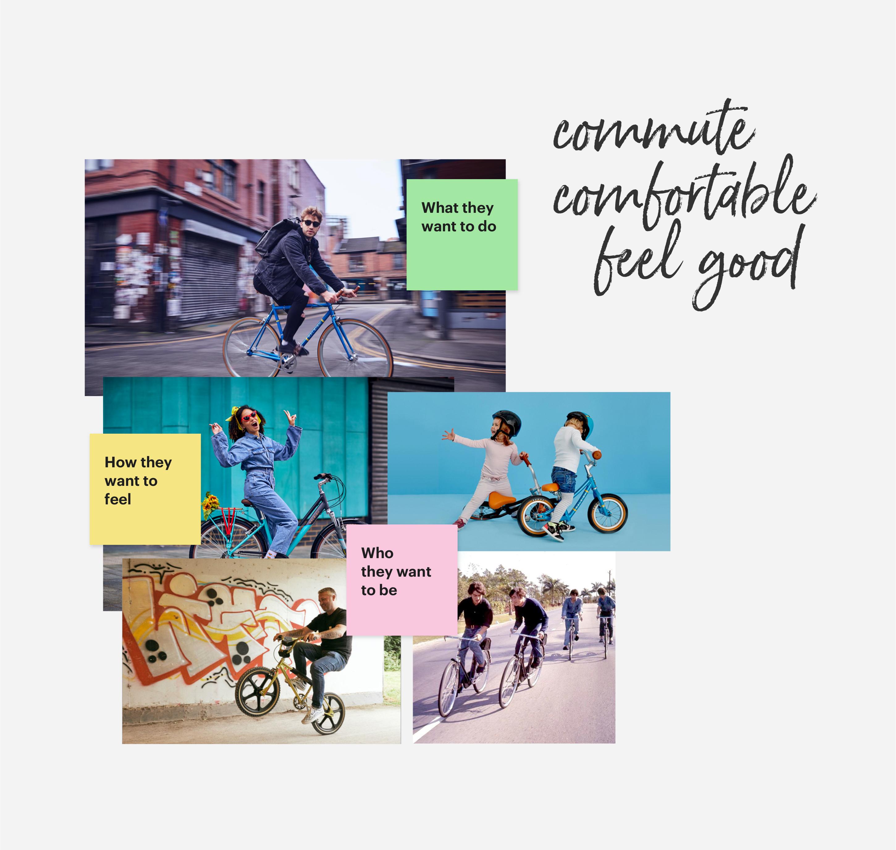
Based on target audience, their motivations and specific needs, we decided for the following categorization (there are brands that have both)
- Sport:
- base of customers ranging from ages 45 to 55, 80% male
- high interest in performance, latest technology and frame design, competitions and famous athletes
- use for sport and leisure, have fun in nature
- a sense of luxury and exotic locations
- Lifestyle:
- wider base of customers from 25 to 65, 60% male, 40% female
- interest in price, color, practicality, functionality, eBikes, comfort
- use for commute
- a sense of affordable and city locations
Play the part
In order to support my team express ideas, design principles and drive decision making, I translated and thoroughly considered customer insights to concepts that addressed customer motivations. I created prototypes to share design best practices that supported content strategy, brand requirements and technical specifications. UX Research reports were carefully documented and opened for feedback which increased the level of understanding of the design discipline.
Design Systems
for MULTI-BRANDS
One of the main focuses of our platform was making sure the content, UI and visuals for each audience was customized and curated to what they needed throughout the entire customer journey.
Configuration System
Design Tokens and Theming
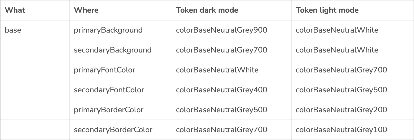
The platform needed to work across brands. To make the desired styling happen we made very good use of design tokens and implemented theming.
Theming is applied on two levels:
- a theme for each brand
- dark / light theming per UI Component
Brand themes are generated through design tokens using Style Dictionary.
Important Note
The configuration system does more than handle styling wishes. It also allows for layout changes, localization, managing different payment systems, etc. Was a pleasure working with Oberon's team of Front-End experts.
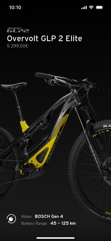
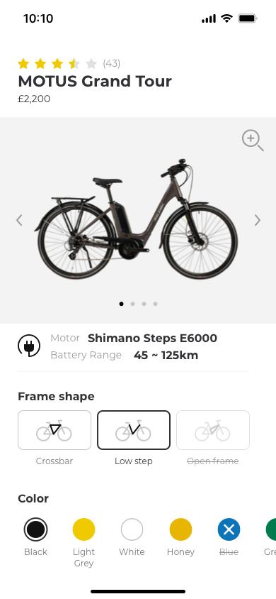
Our team was highly flexible and was able to design and build components that fit together and are flexible enough to be re-used. Design process can at times seem chaotic. With a design system ready, I was able to quikly prototype and test my ideas.
Quick prototyping
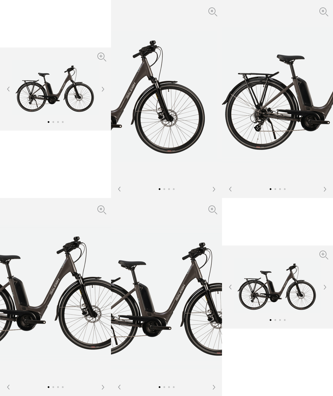
Test and iterate — prototpying helps visualize and think about interaction and motion.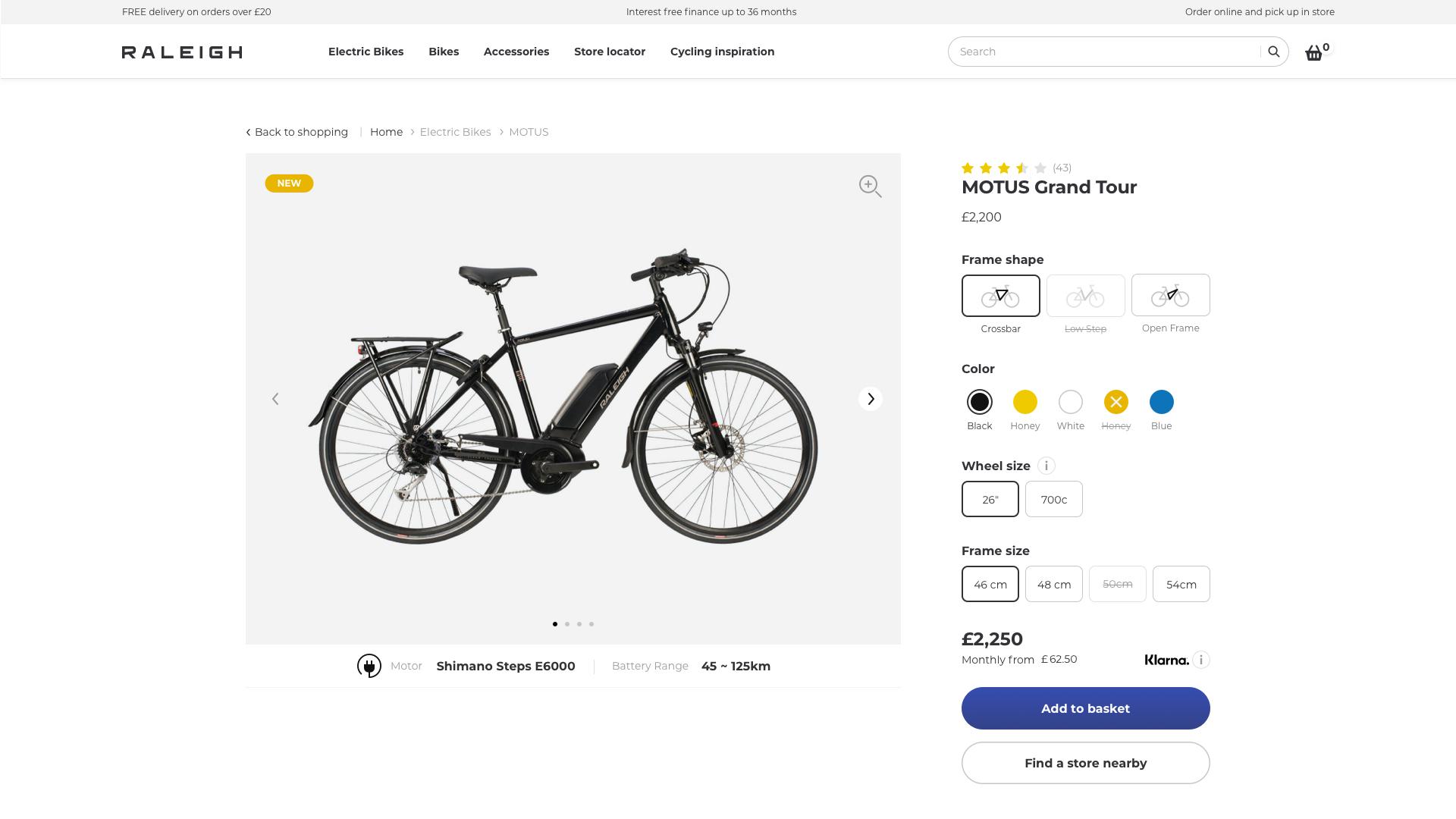
Best Design
practices
UI & Object Components
Ecosystem
Across Disciplines
For all our brands we apply the principles of Object Oriented UX (OOUX). It is a framework in which we think about core content and data as objects instead of artifacts we would normally use such as pages.
Our Design Systems offers structure to build an ecosystem in which all disciplines involved in providing a usable customer experience can thrive.
Naming conventions can differ in their intents, but one of their main perks is that they allow useful information to be deduced from their names based on regularities. Working across disciplines provides the team benefits such as:
- Provides additional information
- Helps formalize expectations
- Promotes consistency within development, content and design teams
- Provides clarity and better understanding for on boarding new team members as the product grows
- Enhances the professional look of the work of one product
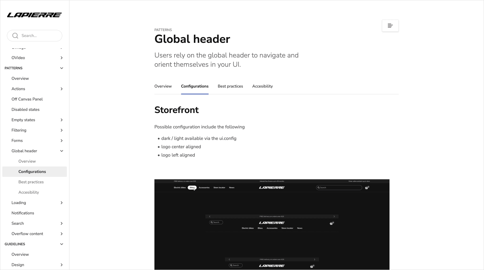
Patterns
Patterns are best practice solutions for how a user achieves a goal. They show reusable combinations of components, objects and templates that address common user objectives with sequences and flows.
Easy Shopping
Experience
Collecting products in one cart makes for an easier shopping experience. One of the most common places in the sales funnel where companies loose customers is the checkout. This is often due to the fact that the process is too long or too complicated.
On top of this the customer needs to be able to find the desired product. To account for these known issues our offerings benefit from:
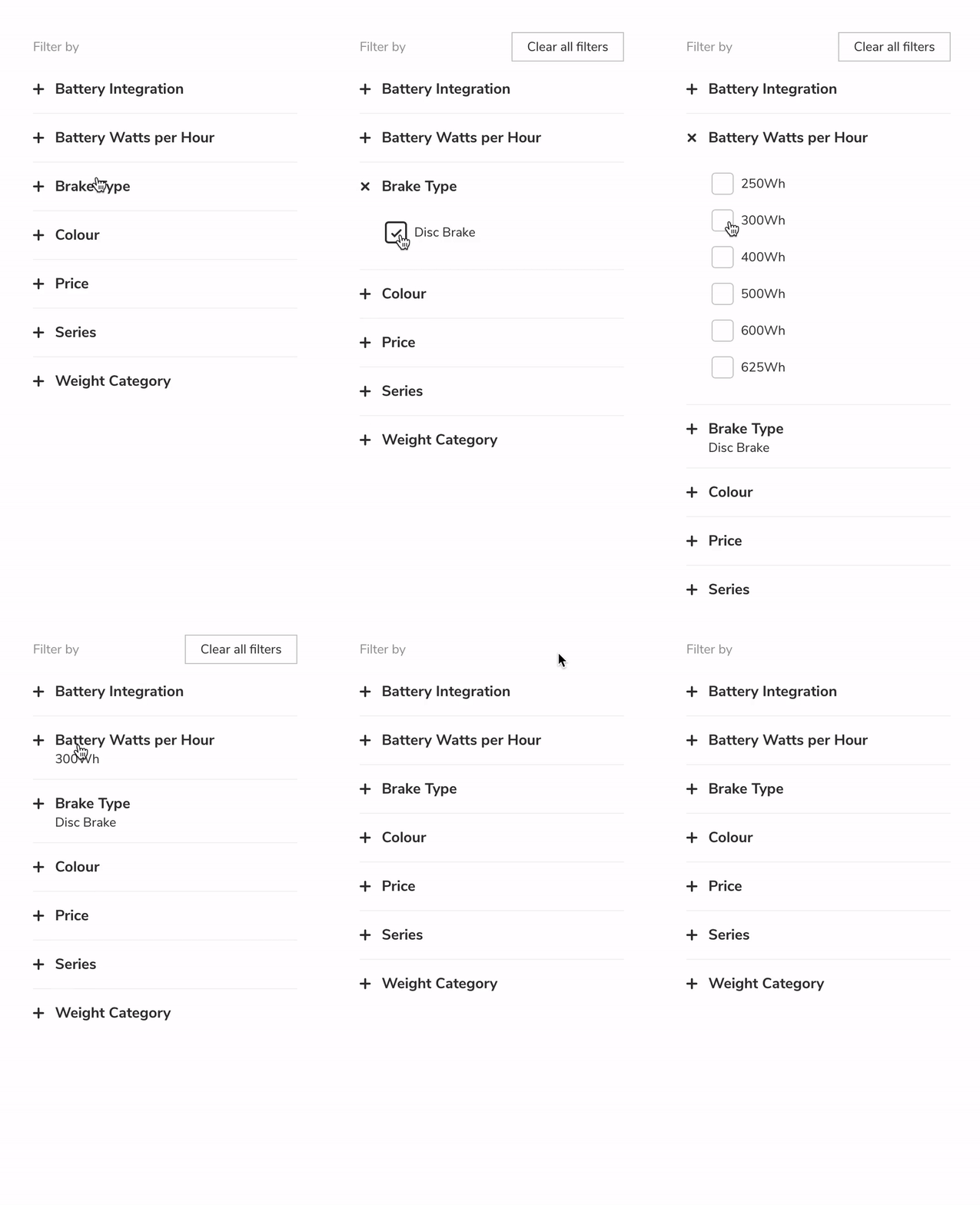
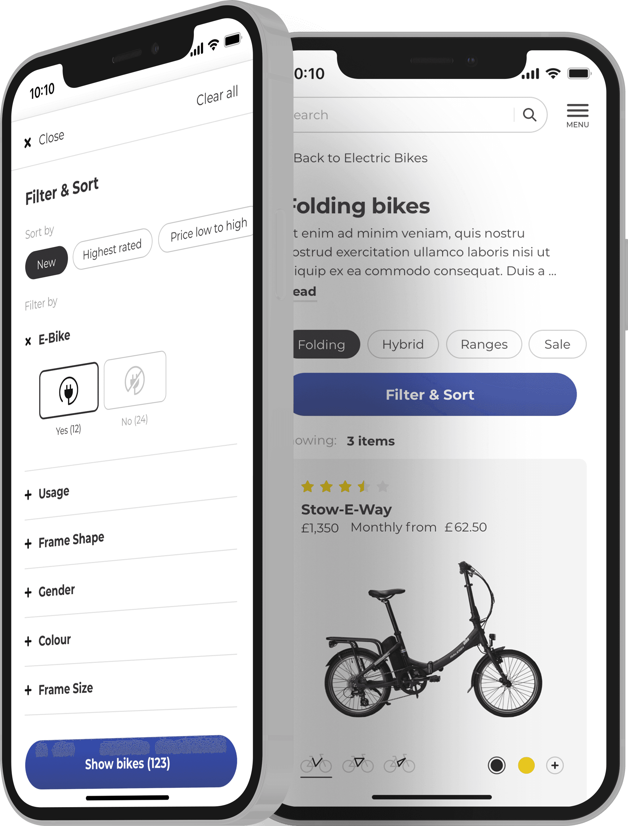
- Discoverability via our search, product listing pages and filtering
- Visibility via our campaign, product line and product detail pages object components
- Easy purchase that integrates contact details, shipping methods, billing and basket overview
- Transparency of contact and payment methods
- Feedback
- Easy maintenance for content managers
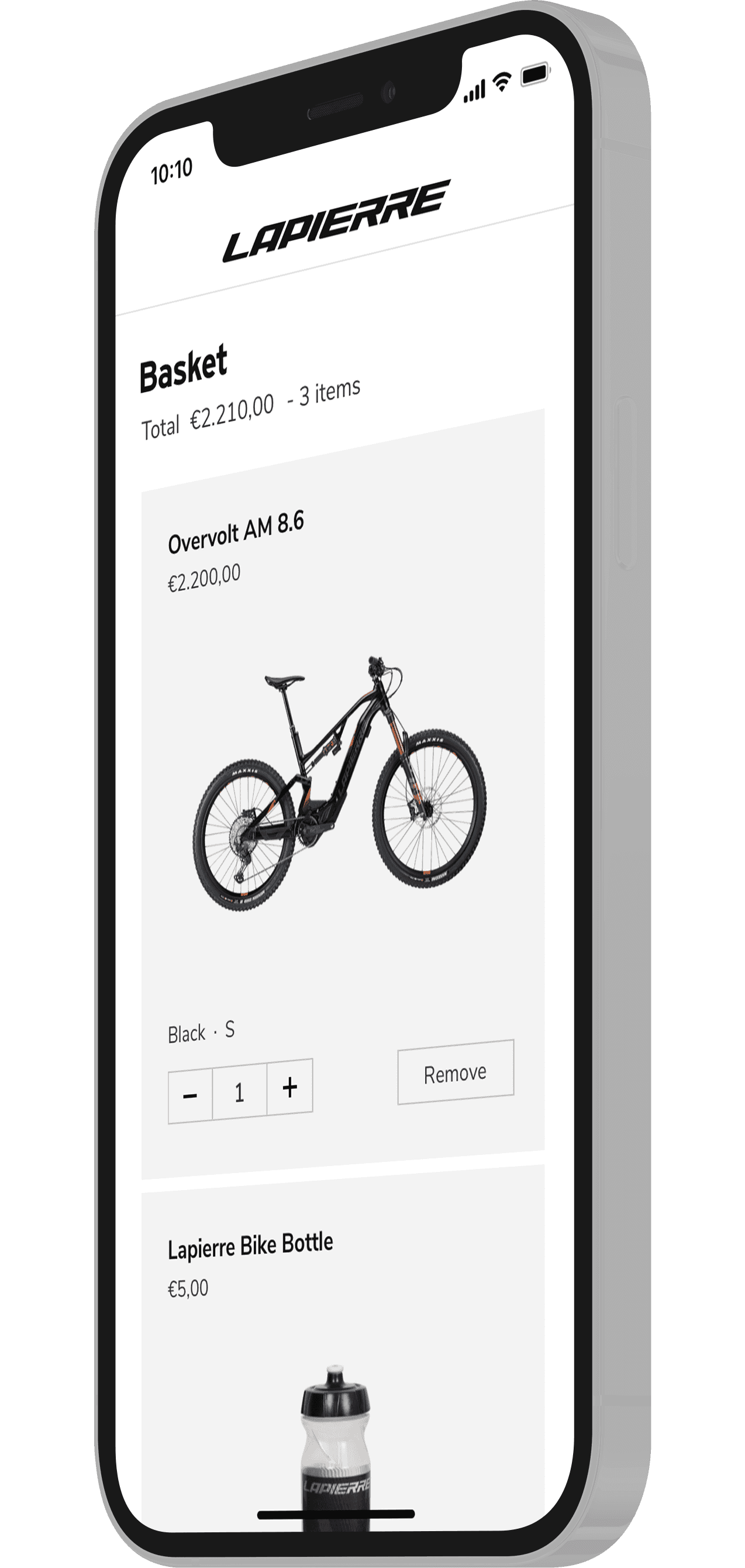
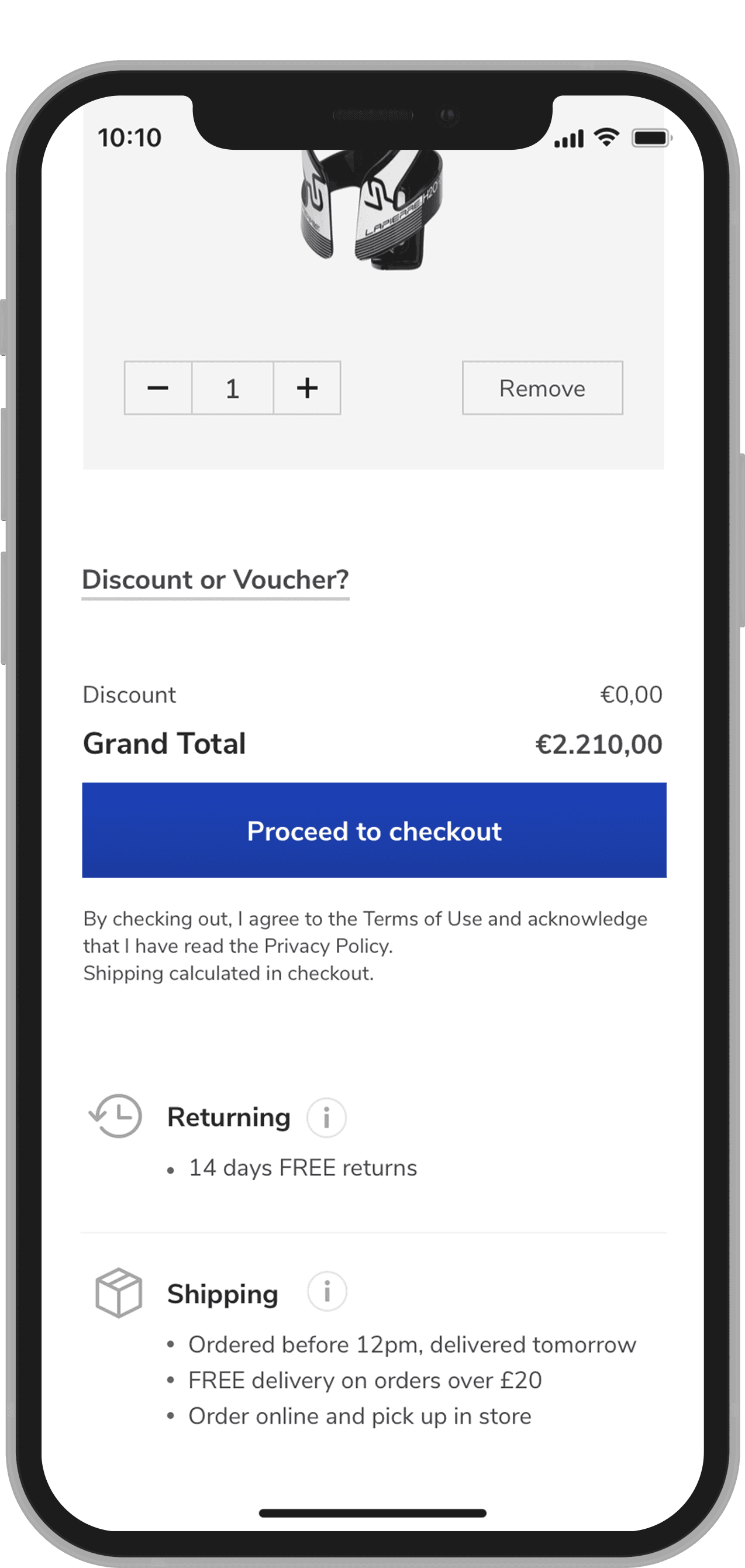
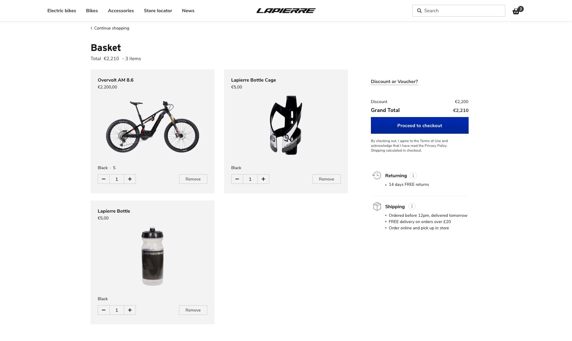
Basket
A basket is a set of products, can be a combination of bike(s) and/ or other products or services that we sell) a customer has selected and 'put in their basket' in order to purchase them.
Headless
eCOMMERCE
It's a good thing
"Headless commerce is an e-commerce architecture where the front-end (head) is decoupled from the back-end commerce functionality and can thus be updated or edited without interfering with the back-end, ... ." — WikipediaBenefits
- Easy to maintain and develop at lower costs.
- Separating the presentation layer from the data and logic layer allows to restructure the content at any time.
- Fast development choose any API, framework or programming language. If the choice is proven to be wrong you can always switch it without re-building the entire platform.
Customizable
and entirely CMS-able
Working within cross functional teams was an essential part of our design approach. Not only we needed to serve multiple brands and their needs, we also needed to design rules of usage that work across disciplines that make sense, are understood and easy to maintain.
Build on Gatsby, with Storyblok as a content management system and Shopware as the chosen eCommerce solution. In sync, as well as part of our Design System, we also have a Storybook library of Object and UI Components.
The End
Deliverables
- Design Systems for Raleigh & Lapierre
- Documentation
- UI Libraries in Sketch
- OneDrive setup (for assets management)
- Code (for UI Components)
- Design Tokens
- Prototypes
- User Flows
Personal Note
The Take Away
Lack of a common goal lead to the launch being delayed. Capacity led to coordination challenges within teams. In order to be effective I worked closely with front-end, content, SEO and design. I was support on a daily bases to ensure completion of components.
The UX Design team had a more linear approach in the way of working, with UX Research leading and UI, Content and Development to follow. This led to the process of decision making being at times one sided, but it helped with timelines and prioritization. I expressed my concerned that collaboration and communication are vital to a team’s performance.
Design was included into an engineering-driven process. This meant that the time to create designs was the time left-over.
Out there
View Lapierre.comView Raleigh.co.ukMore from
Featured work
UX and EyeCandy.
© All rights reserved. Images belong to the brands.