I was part of the established design team and responsible for the design system and visual experience strategy of the new global Lapierre website. I lead the UI and art direction work, producing all major deliverables and presenting these to stakeholders. I worked alongside branding managers, a graphic designer, content editors, SEO specialist, developers, a UX Lead and a product owner. Daily operations included working agile in 2 weeks sprints.
Disciplines involved
Design - Branding - Content - Development - SEO
The challenge
Our team was under pressure from both a deadline and a pandemic. Communication proved rather difficult at times due to external personal factors and distancing. However team proved resilience and professionalism. On top of this our design system and our platform needed to adjust to new requirements from stakeholders, which wanted a strong visual presence. Existing content was in need of a management system. New assets needed to be created.
As an active biker I want to benefit of the latest and greatest technology So that I can feel empowered, confident and self-aware.
Persona, Goals / And Emotional Design
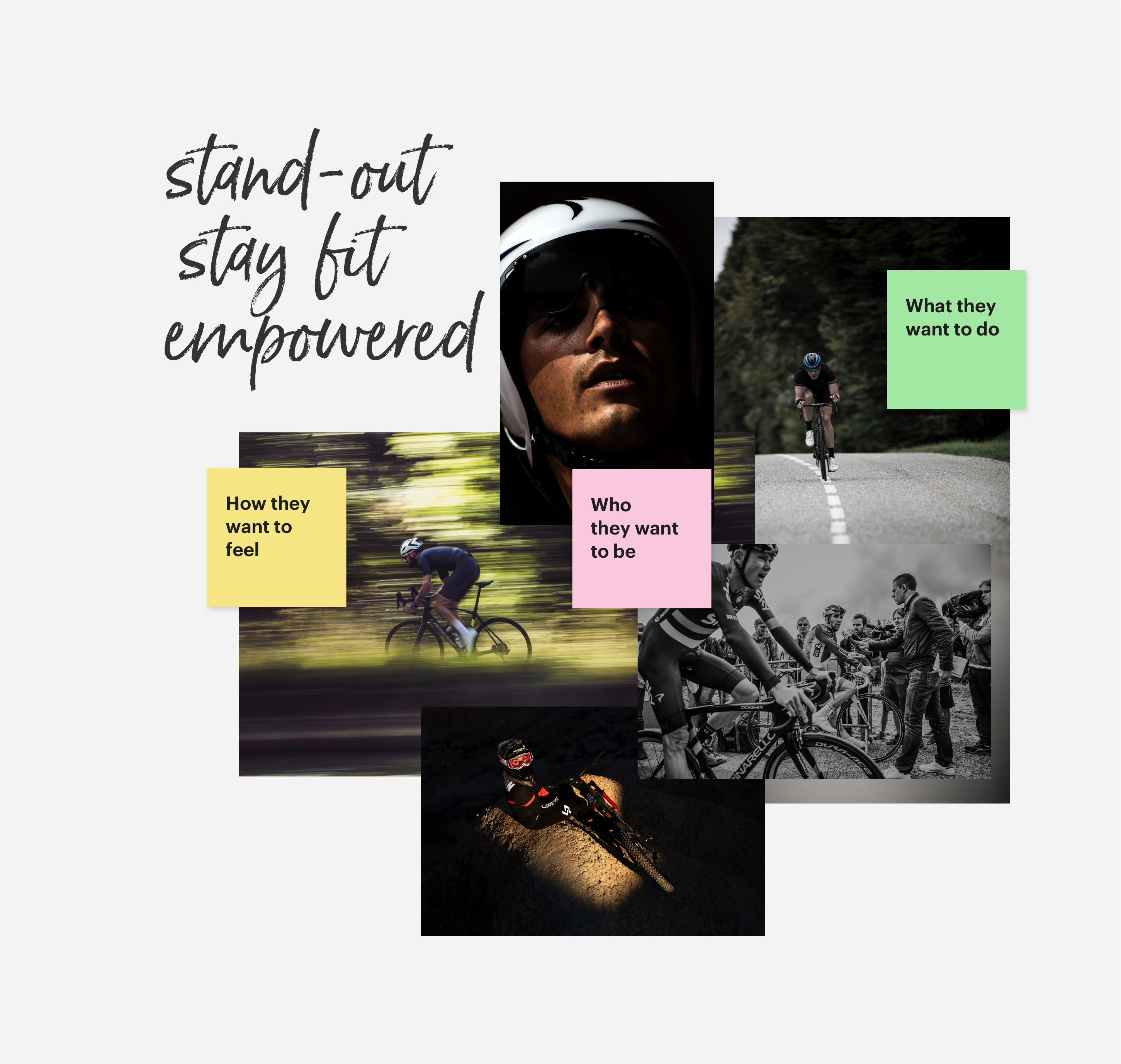
When I'm being asked to "make it pretty", I fall back to "emotional design". According to Don Norman's book — "Emotional Design", it's important to translate end user goals into the product's experience. We need to consider the user's motivations:
How a user wants to feel
What a user wants to do
Who a user wants to be
DesignSystemat work
The aim of the Design System is to ensure we all share the same point of view on the position of Lapierre in the world, so that we can continue to build our global brand in a uniform and consistent way. Based on OOUX(Object Oriented UX) framework. Add Gatsby, kept together by Storyblok, mixed with Shopware.
Brand Driven / Core Design Principles
Brand benefits were at the core of design decisions:
Target audience of sporty and active leisure bikers
Functional design to incorporate quality and innovation
Emotional design to empower, feel confident and self-aware
From Brand Book to Online Presence
To understand Lapierre's spirit we must first acknowledge why the brand exists, what do they do and what drives them.
Brand story, archetype and foundations — for understanding the brand essence and the target audience
Visual Guidelines — for achieving the best visual content when creating and using product imagery, beauty shots or lifestyle photography
Visual Language — for aligning visual constrains within cross functional teams: Color / Space, Grid and Layout / Fluid Typography / Iconography / Interaction / Motion / Imagery
Visual Design in Balance with UX and Content
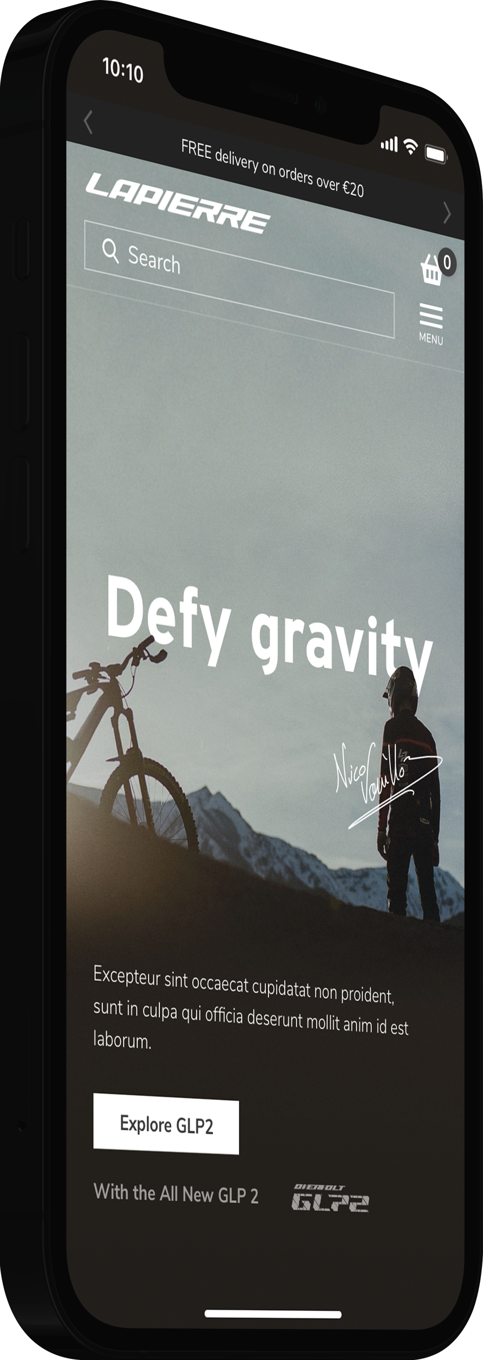
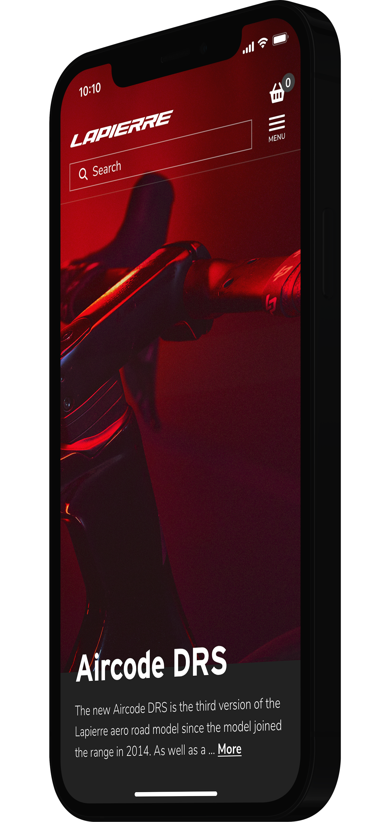
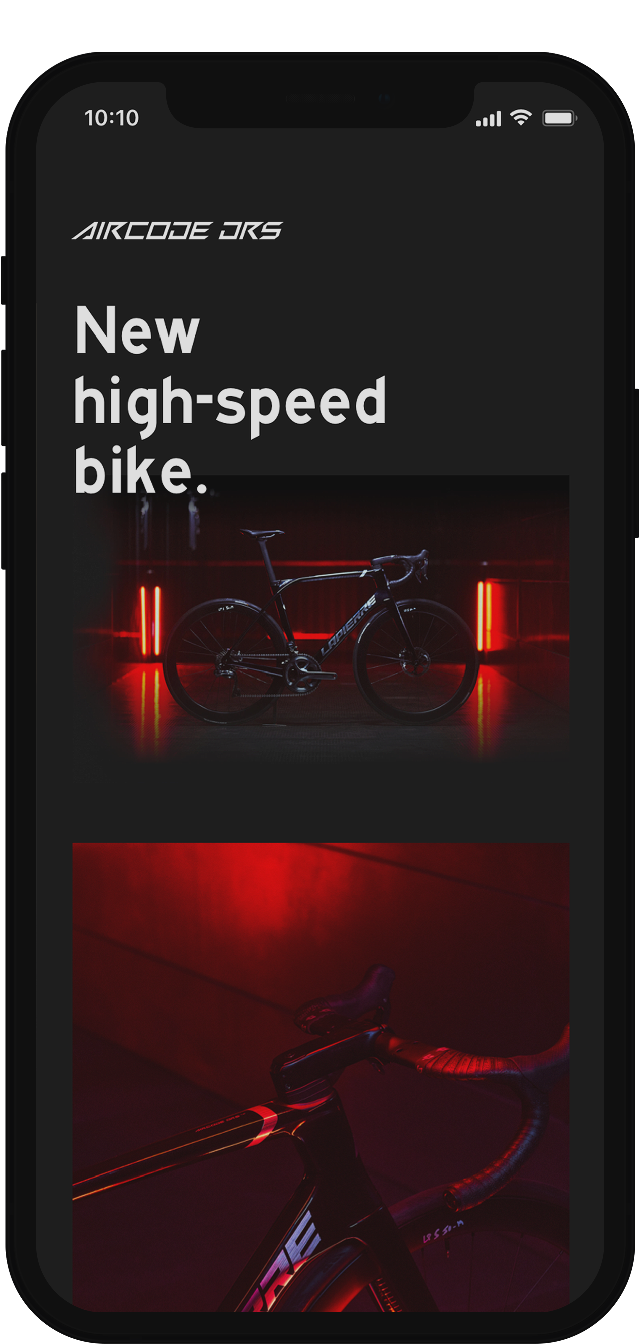
We took the challenge to implement a dark theme to suit the brand's art direction of Suspence — Subtetly — Balance. "Lapierre's elegance lies in tension and suspense. By not revealing the gear in its entirety. By leaving our audience to wonder."
According to the branding book: "We achieve that by playing with lights and shadows, underlining the gear or emotion we want to highlight, and leaving the rest in the dark. Visuals have a unique signature, half-way between premium shots and reverie photography."
* NOTE: Only the chosen ones may see it, so be prepared for a password.
UX & Visual pleasantries
Users want to see a beautiful bike where technology prevails. Match the filename with an SEO keyword and the right copy description and you design for both robots and humans.
Brand, Neutrals, Semantic
Colors and Accessibility
To structure an easy maintenance strategy within the multi-brand headless platform the colors were split as follows:
Brand
Global
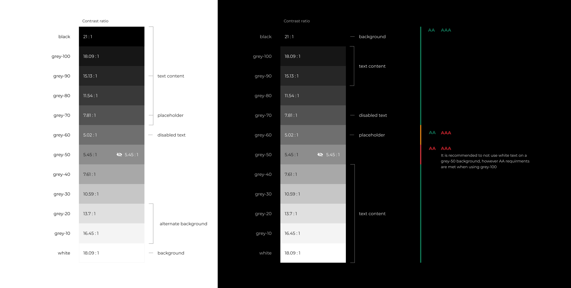
Neutrals — they can work alongside any brand color and don't draw a user's attention away from the main focus on a color manipulation task or workflow.
Semantic — they have assigned meanings used sparingly and intentionally to reinforce hierarchies and to create clear modes of communication.
This allows the brands to customize their own colors without the fuss of dealing with selecting functional colors. Neutrals and semantic palettes have been carefully chosen and tested to ensure the best possible contrast (AA/AAA compliant). They also follow design patterns to set expectations of meaning for users.
Full-OnBrandexperience
It's not about a trend
Light vs. Dark
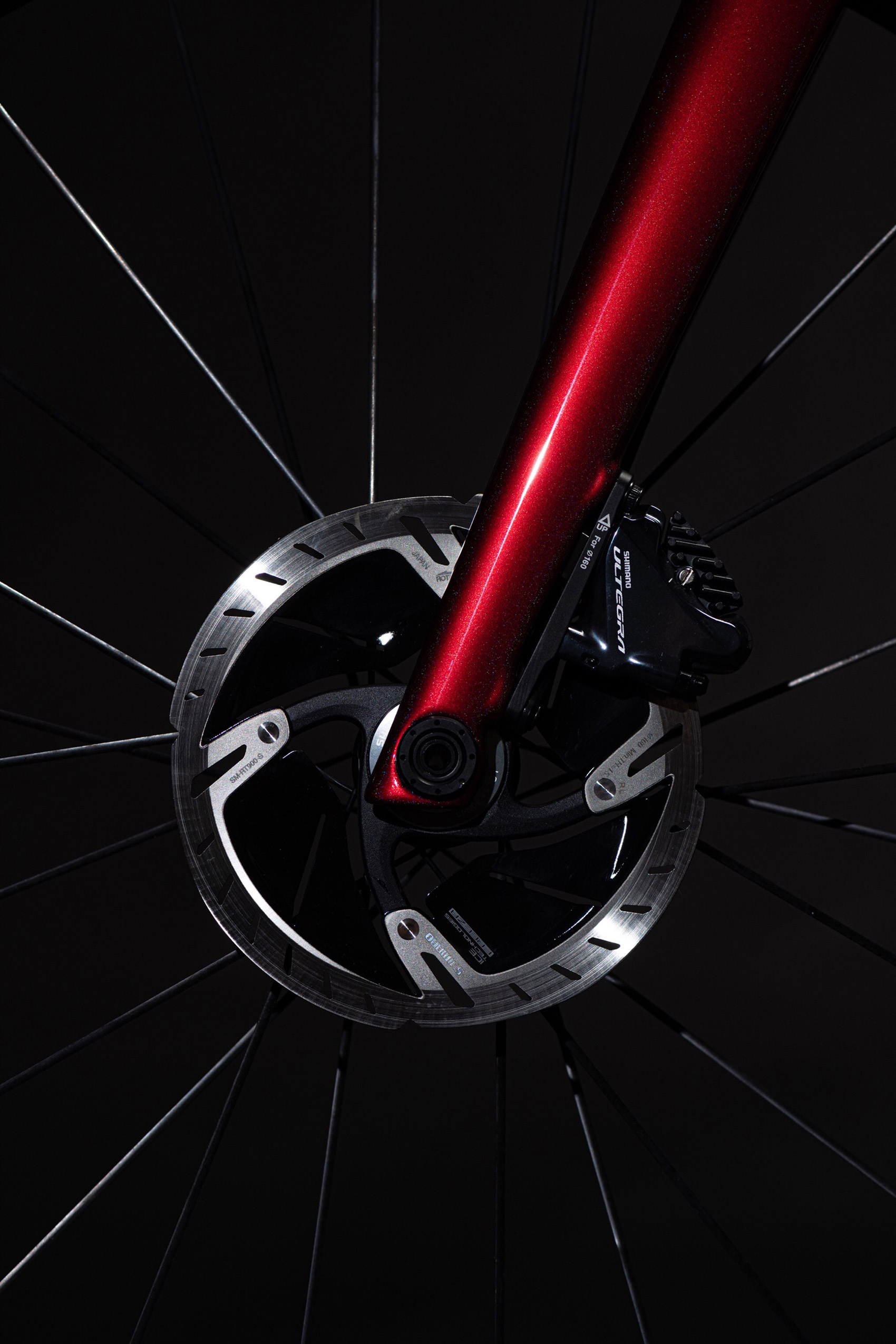
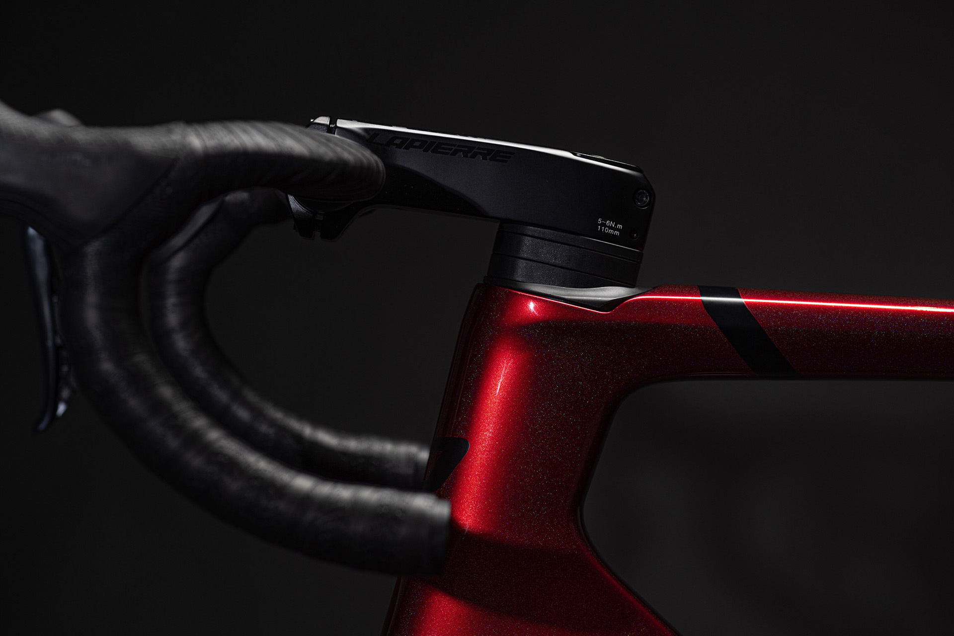
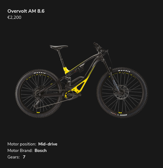
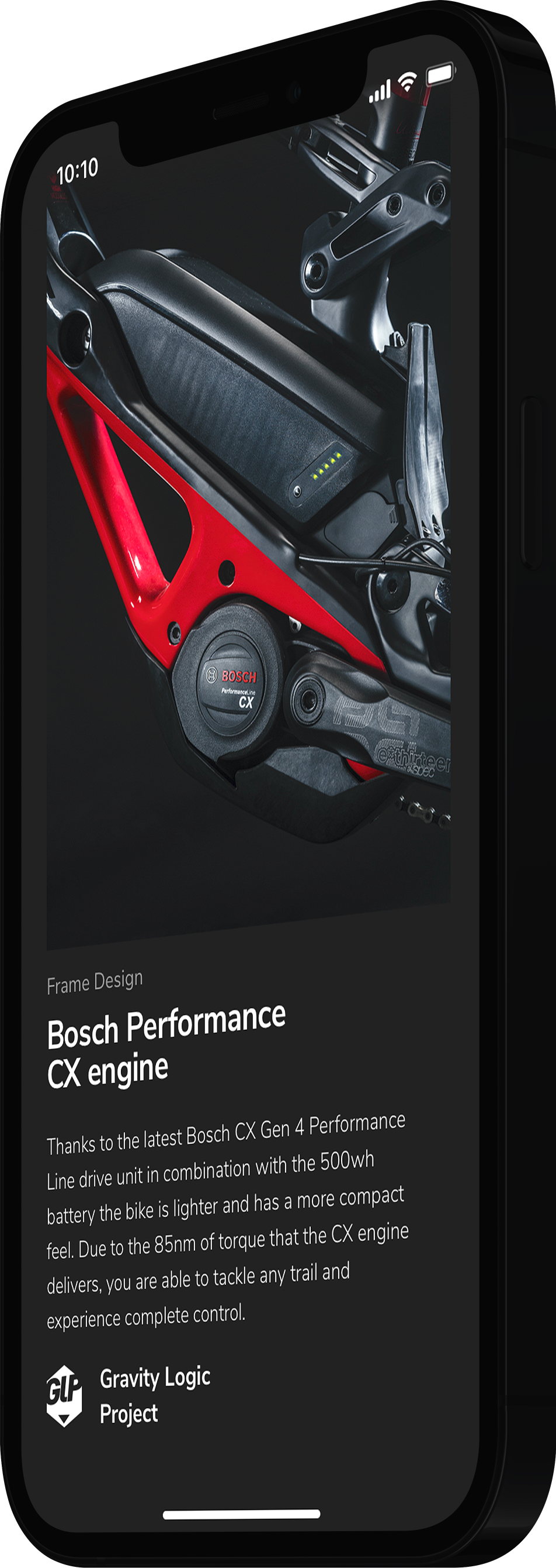
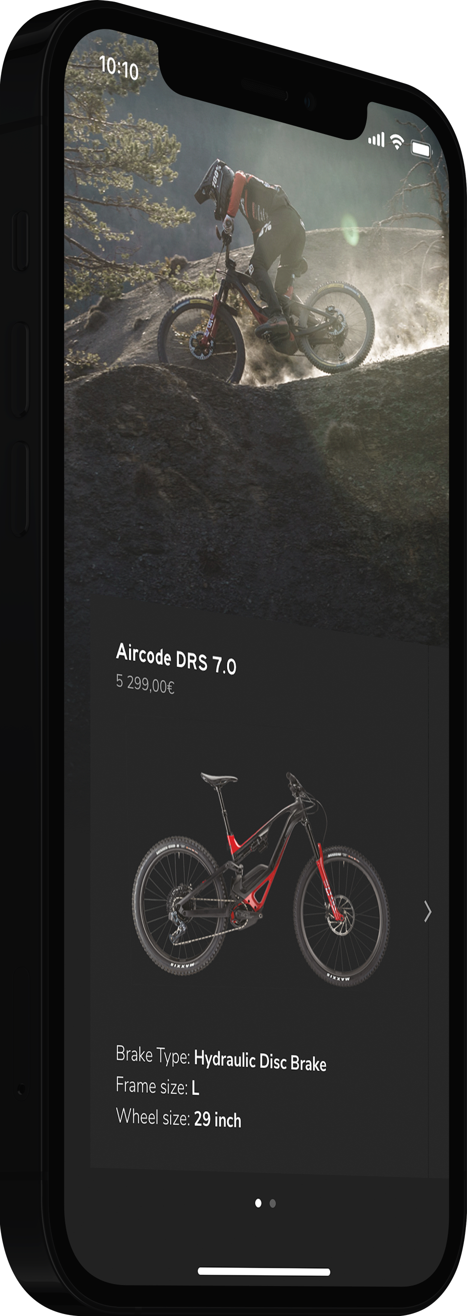
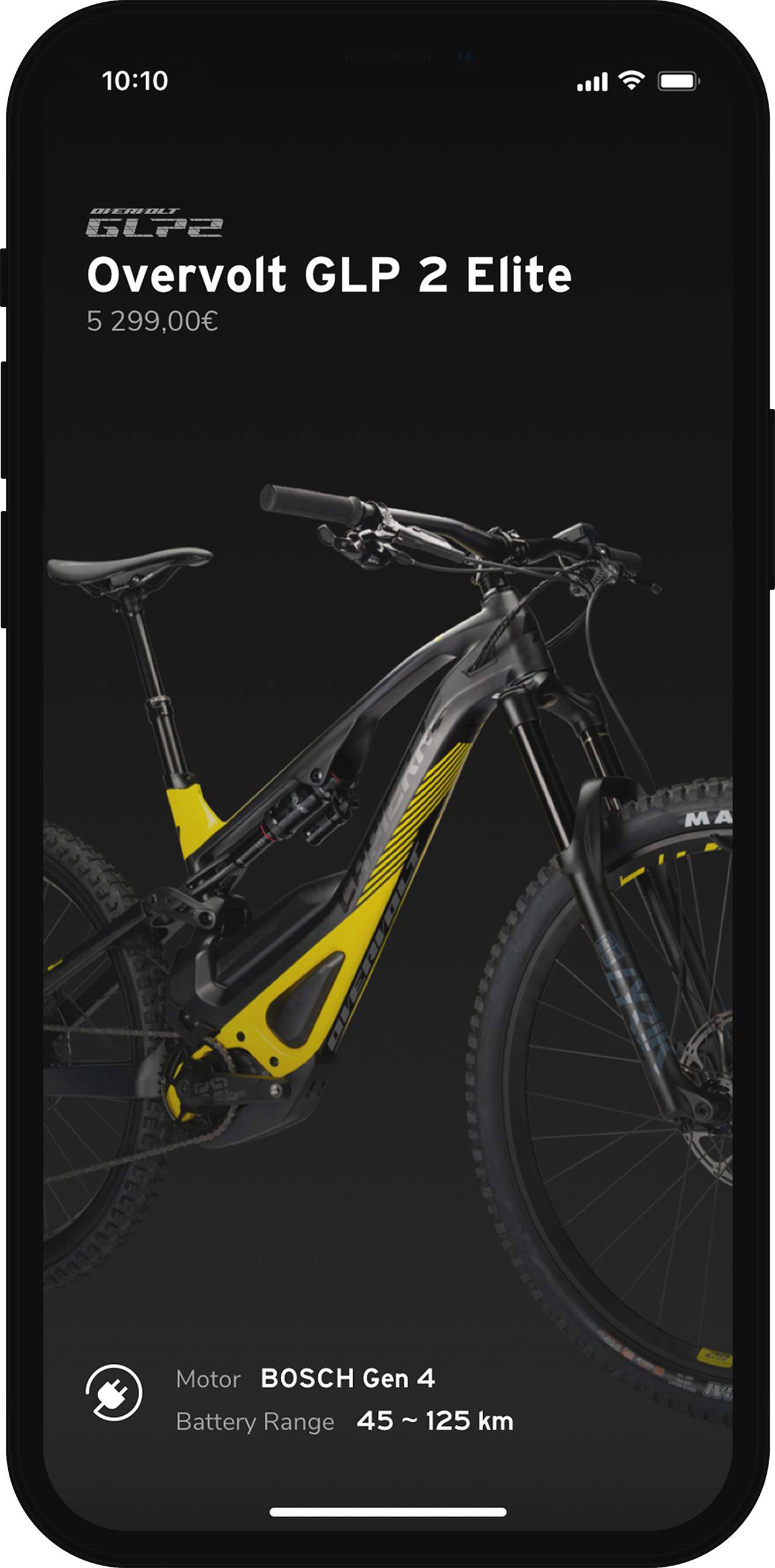
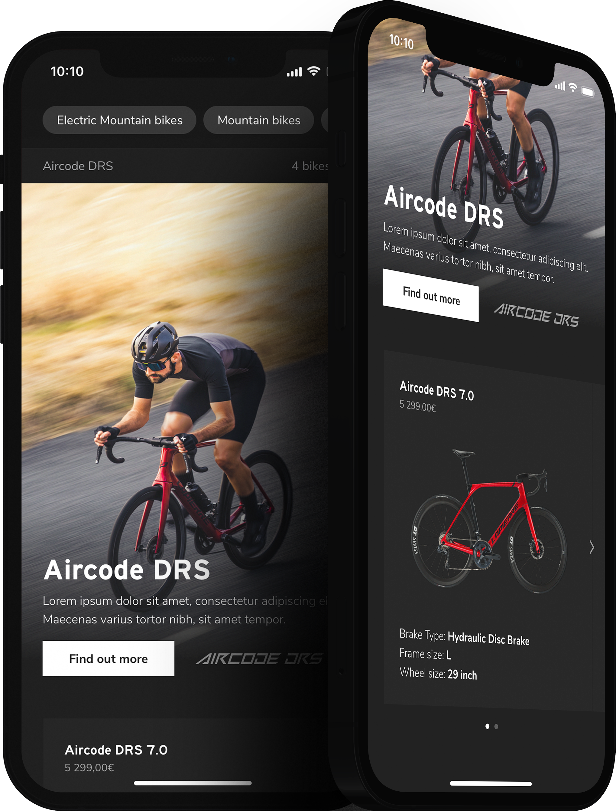
Dark mode was a requirement from the Branding team, as a stakeholder. The UI needed to be dark when showing beauty shots(1) to enhance the elegance of the bike design(2).
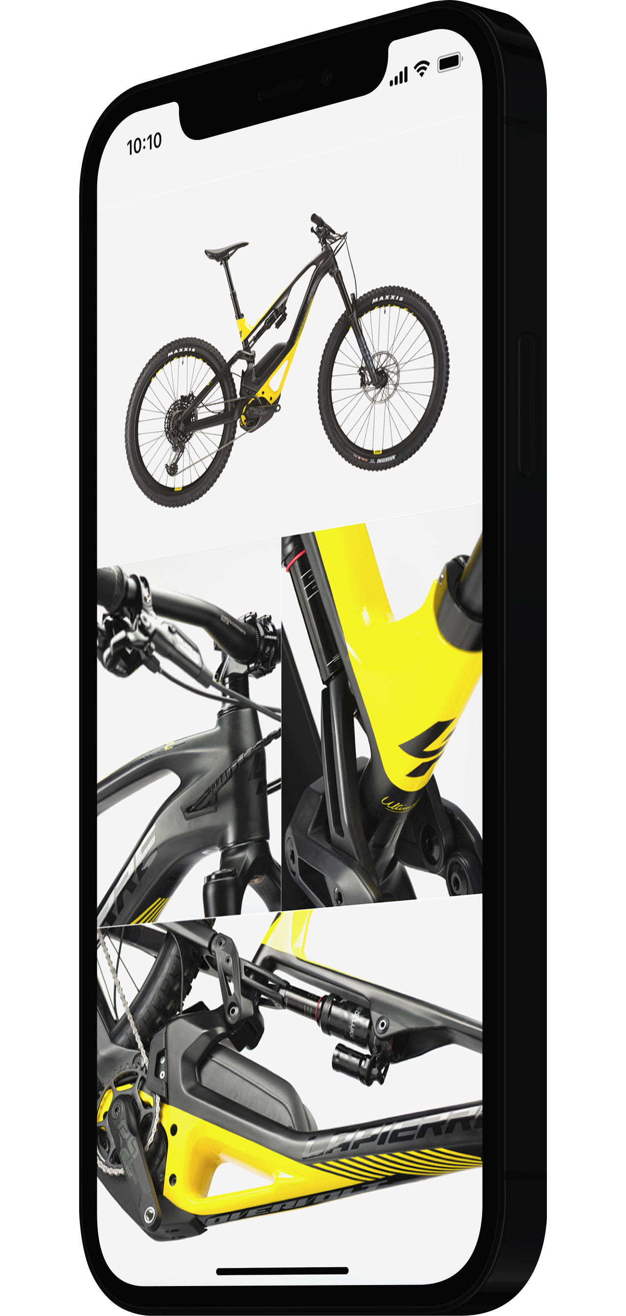
Beauty shots (1) offer an in depth detail shot of a product and can be very effective at highlighting a product's design features and/or technology. They are different from a product detail shot as the art direction approach is to quantify as much as possible the design. Beauty shots can effectively be used instead of product detail shots.
Reasoning (2) — Being photographed against a dark background would highlight the frame shape and its color, thus a light UI background would take away the focus. Achieving the best contrast was key.
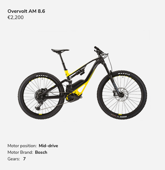
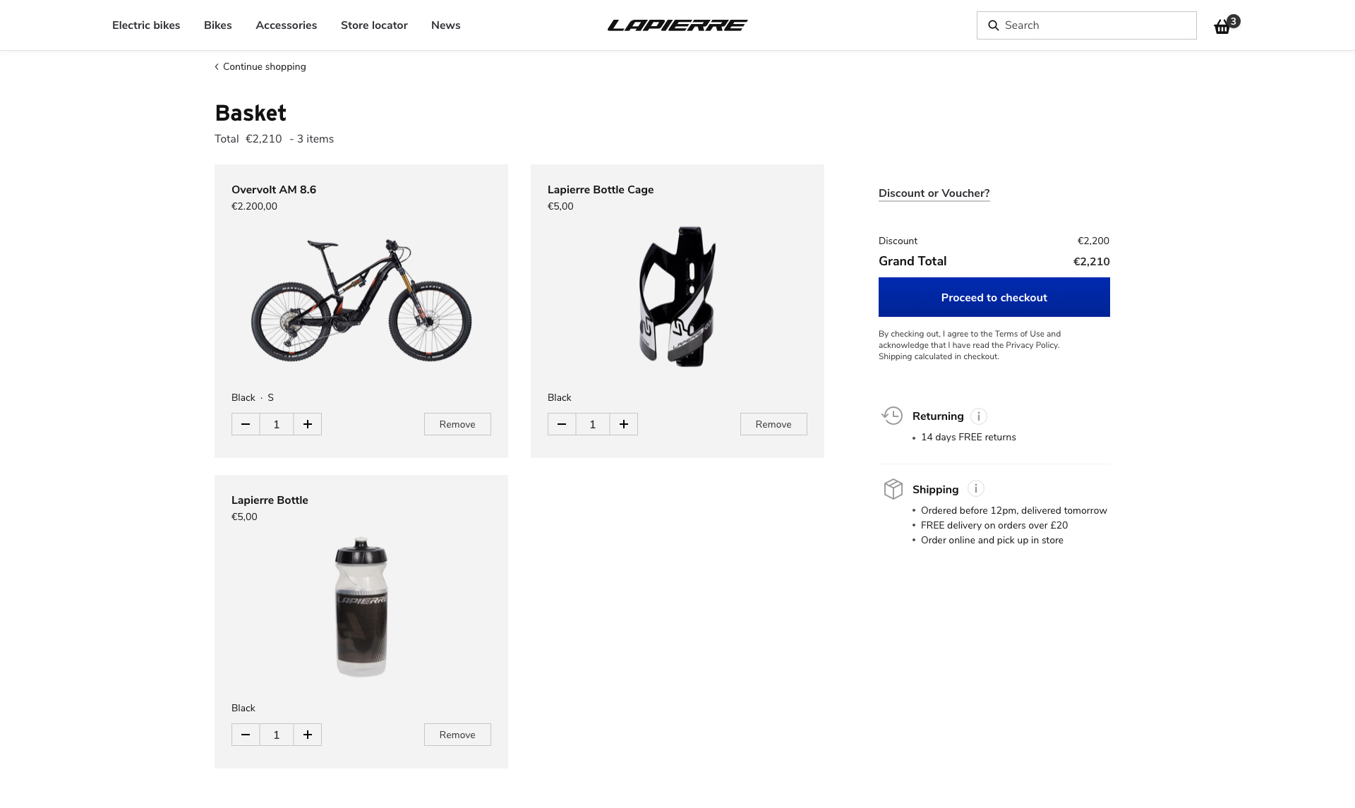
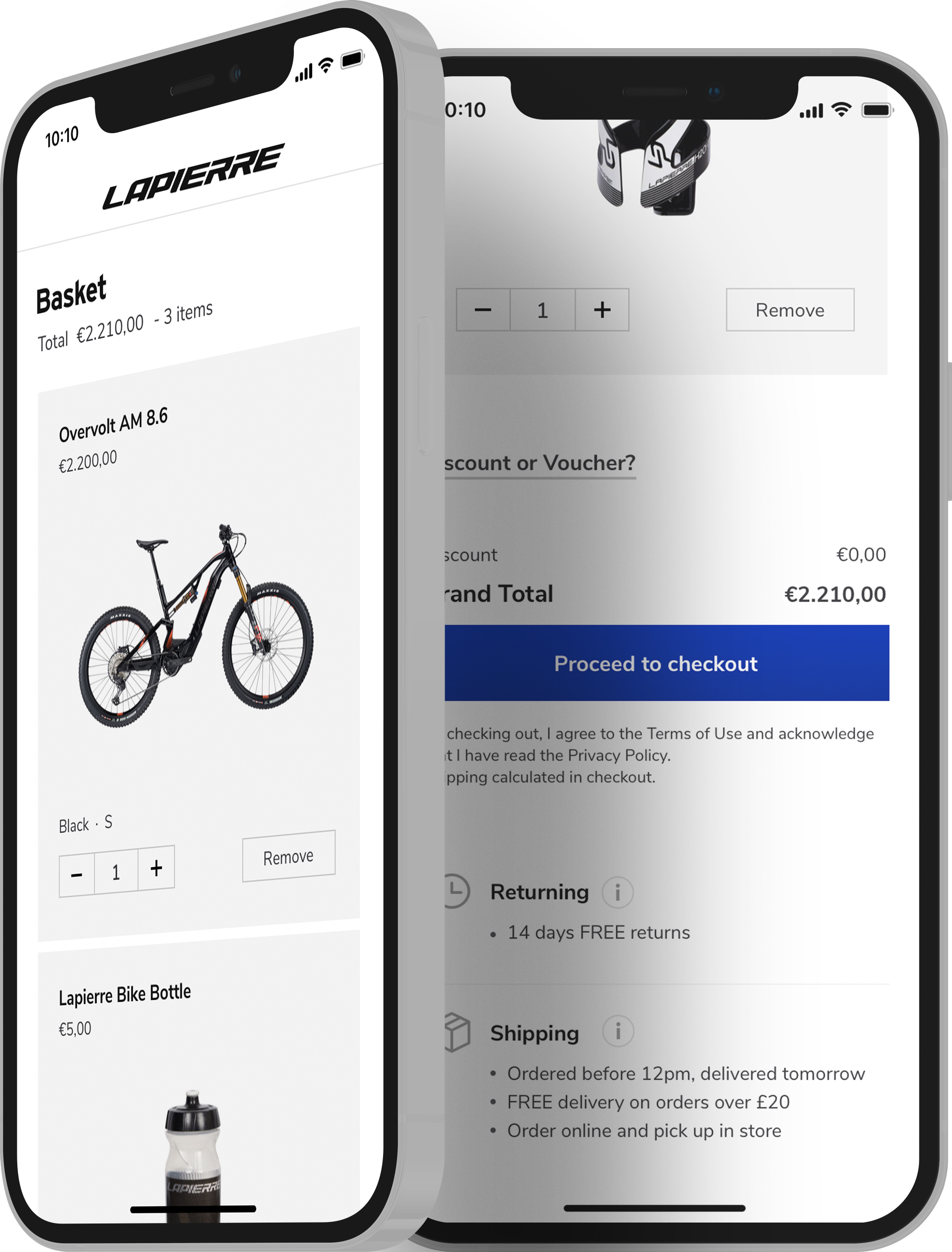
In opposition to orientation pages, the functional and decision making sections of the website were kept on a light mode, to ensure that users's experience was not altered. Such is the case for product listing, checkout and articles.
In achieving technical depth in visual design the following were carefully considered and touched upon:
Brightness — to distinguish details (text and imagery work seamlessly).
Contrast — to ensure legibility and focus.
Layout density — to display relevant product information based on Marketing research consolidated by UX research and validation.
Campaignthe visualobject
The Campaign Object
A campaign is a series of activities around informing, reminding or persuading its target audience about its product or service, across various mediums.
Content blocks are conected with other defined objects making possible various combinations to help quickly, easily and with speed build an online campaign.
Campaign Banner - the image or video should is different from the one in used on the homepage to avoid being flagged as duplicate content.
USPs - uses the same content block with different content managed from the CMS.
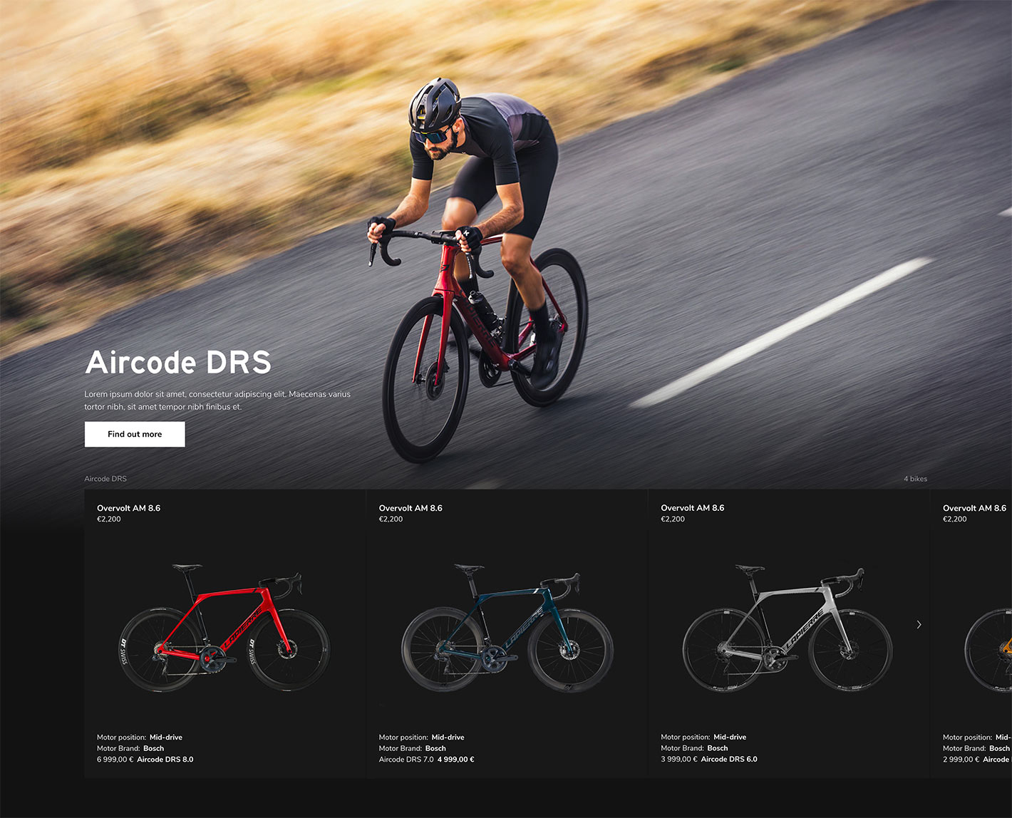
Product line object shows a preview of the entire range of products, including access to the product detail.
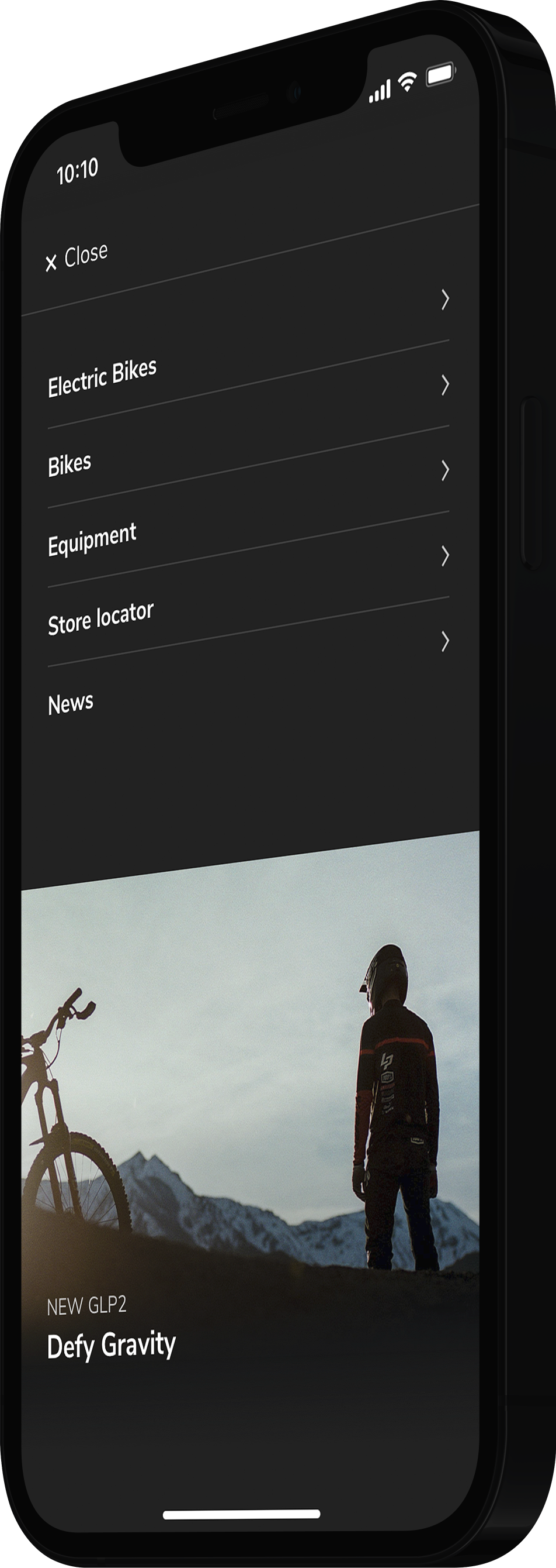
Overlay Menu - shows active campaign. Please note that content managers are able to do so via CMS from only place. Multiple active campaigns are also possible.
By The rules
Image Product Gallery
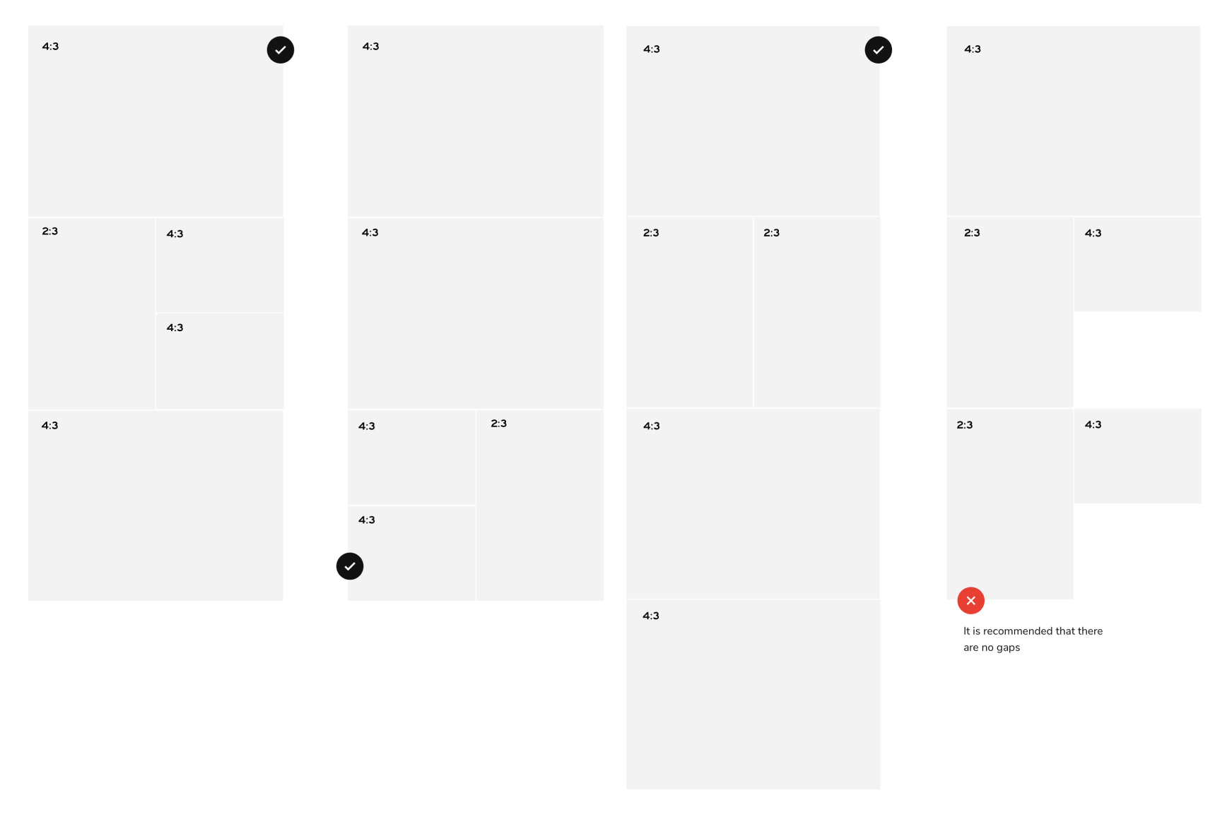
Image grid is, as its name suggests, a solution to display all product images in an engaging way. It was designed to work with aspect ratio as follows:
4 : 3 for landscape
2 : 4 for portrait
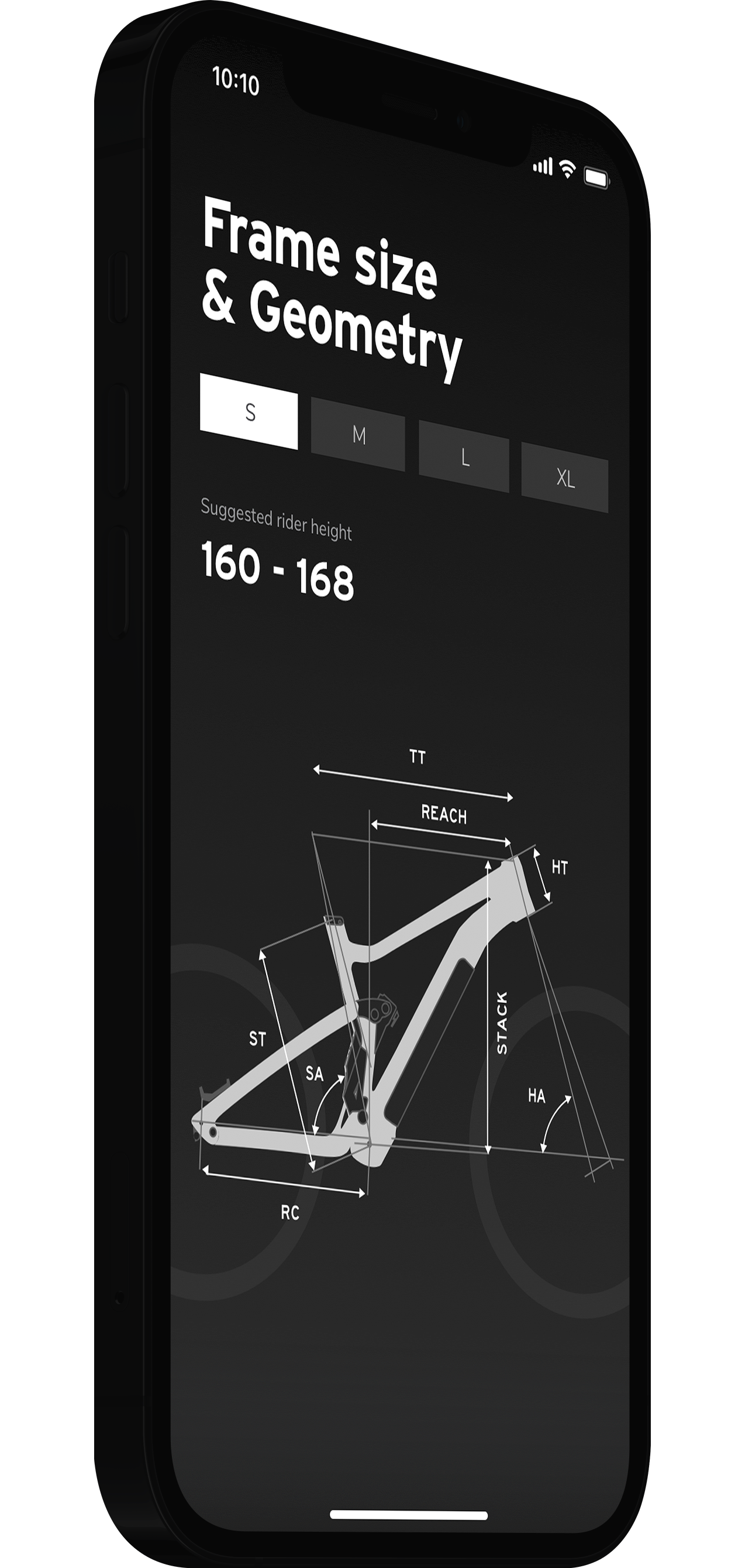
Size & geometry section — industry standard plussed by interaction.
Product hero — enhances the product and pushes the brand.
Product gallery — product images are taken to the next level.
TheProductLineSeries
OProductLine — A product line is a group of connected products marketed under a single brand name by the same company.
Lapierre offered me the chance to blend many perspectives within a single user experience. In hindsight I should have been more vocal when designing with content that we didn't have. I should have promoted more the importance of Visual and Emotional Design within the customer experience. Usability was put at risk for both customers and teams involved.