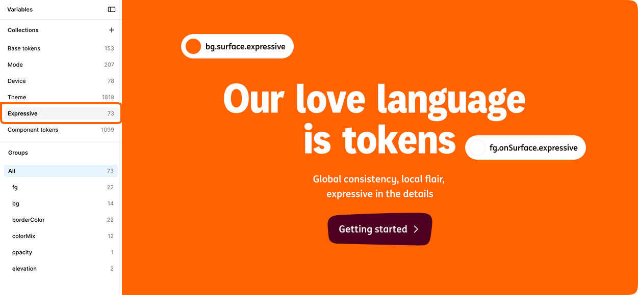
ING needed a way to scale design consistency across thousands of components, multiple platforms, customer segments, and local extensions while introducing a new visual identity and ensuring accessibility by default.
One Brand, Many realities
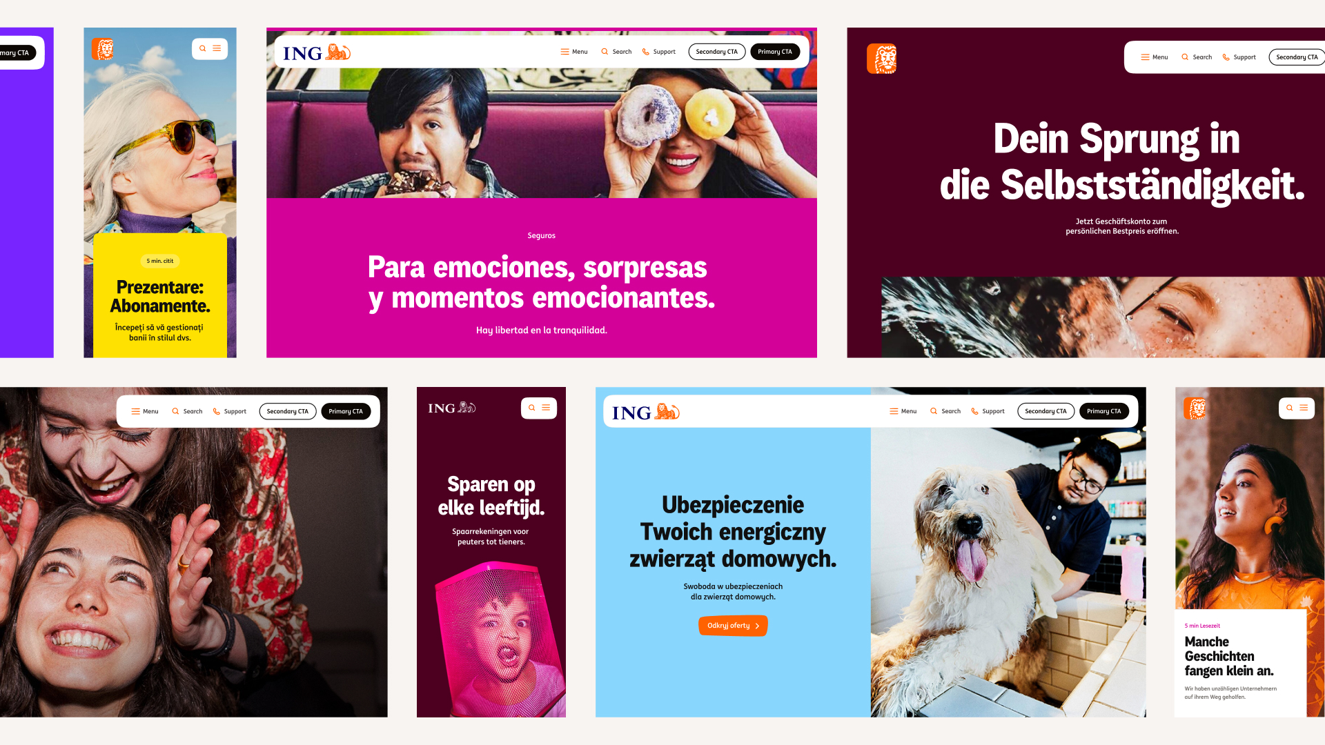
ING operates across multiple markets, customer segments, and digital products. Local teams had evolved their own design system extensions to solve local specific needs, resulting in fragmented experiences and duplicated effort. The challenge was finding the balance between global consistency and local flexibility without forcing every market into the same solution.
Complexity at scale
The design system needed to support:
- Customer segments
- Light and dark modes
- Cross-platform experiences
- Accessibility requirements
- Future visual identity updates
Every new visual decision multiplied the number of combinations designers and engineers had to maintain. As the system scaled, manual management became increasingly difficult and error-prone.
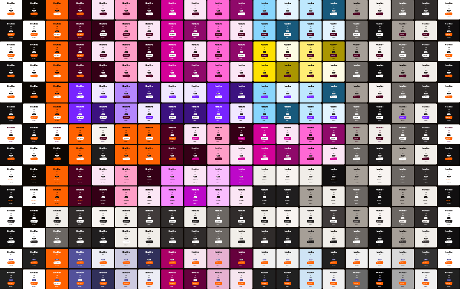
Color was becoming a maintenance problem
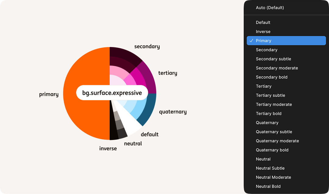
Color was one of the most complex areas of the system. Designers needed ways to create emphasis, support storytelling, and express different brand personalities while remaining accessible and consistent.
Yet every new surface, theme, or mode dramatically increased the number of possible color combinations. The result was a growing dependency on manual decisions, reviews, and accessibility checks.
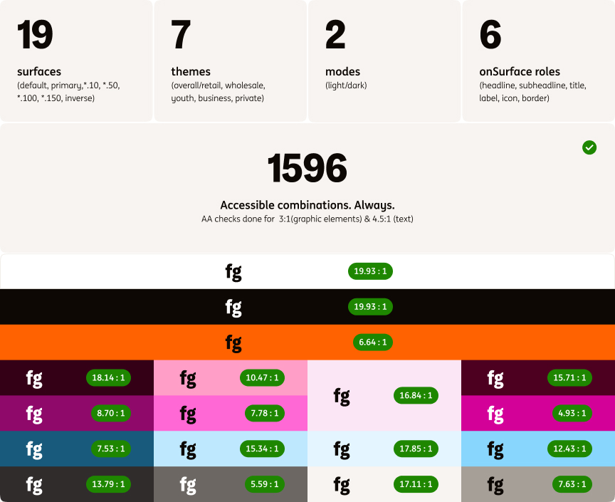
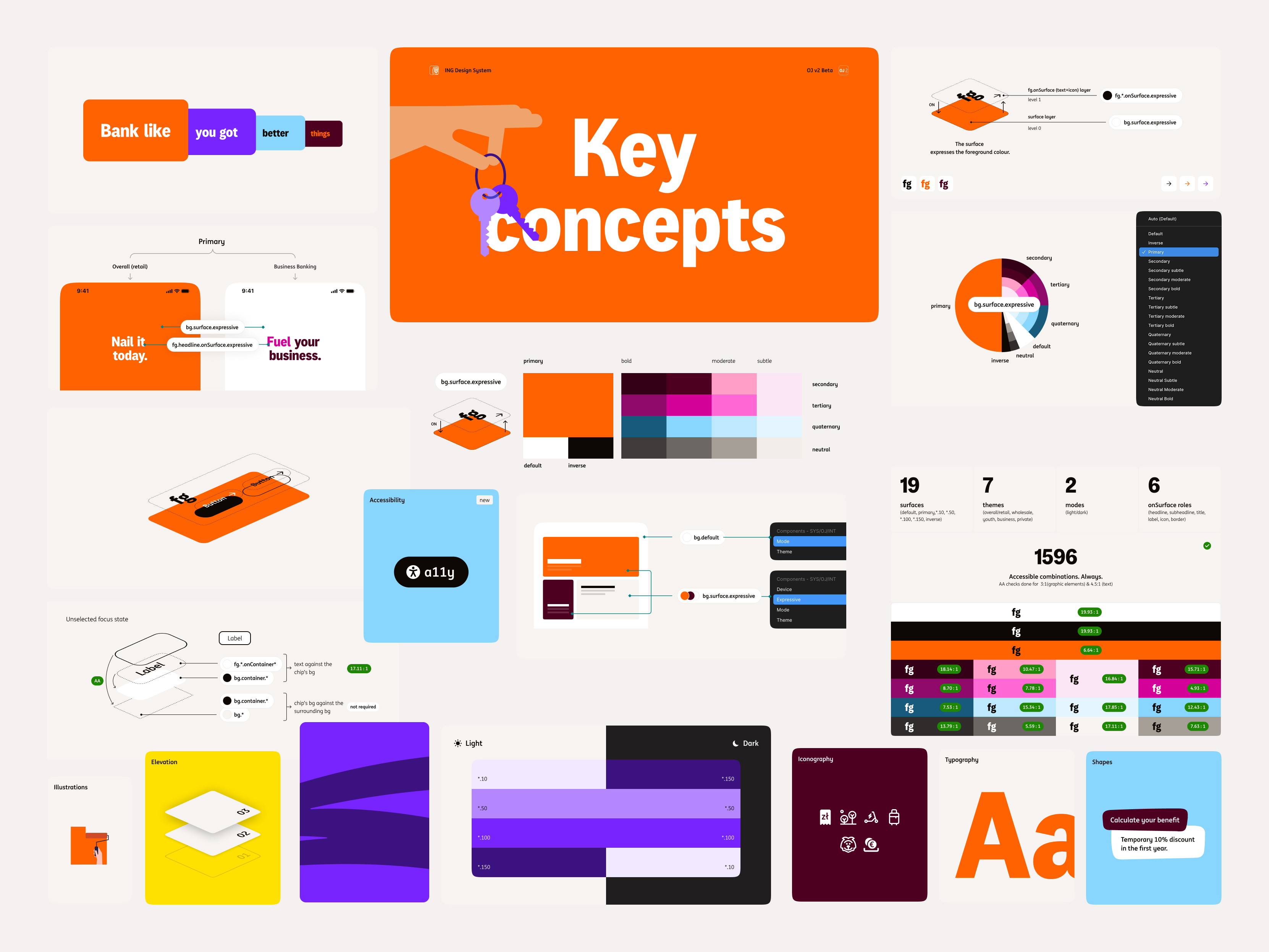
In practice, a relatively small set of surfaces, themes, modes, and foreground roles already produced more than 1,500 accessible combinations that needed validation.