My role
Product Design
Company
Years
I led the efforts to design a new investment app from scratch, utilizing design thinking to overcome the challenges of unfamiliarity with the investment industry, all while delivering within deadlines.
Disciplines involved (A-Z)
Branding — Design — Development
The Challenge
Having limited knowledge about the investment industry and working under a very strict deadline forced me to tackle UX and UI simultaneously. This was only possible by staying grounded and prioritizing tasks. The development team supported the effort by focusing on creating a minimal lovable product (MLP) and leveraging native solutions to avoid customization. We reserved additional custom features for after the launch.
From pitch to
polished product
The Ask
The client was looking for a solution to design and implement a completely new investment app that was easy-to-use and deviated from traditional models. While convenience was a key proposition to attract growth, it was essential to maintain depth and credibility, ensuring the brand remained financially trustworthy.
Overarching business goals
Oberon aimed to demonstrate its design process and solutions, highlight its UX/UI capabilities, stay within budget and on schedule, and introduce design systems as a method for scaling brands and platforms.
Our approach
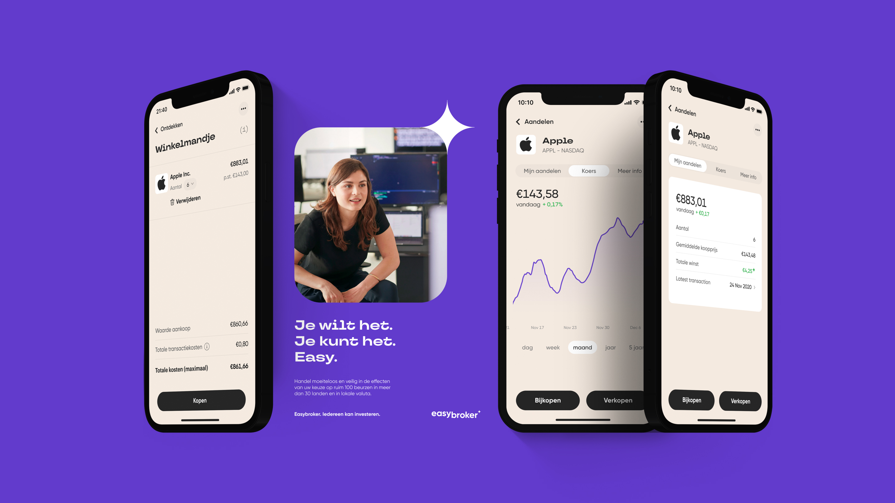
We designed an intuitive investment app for the client, featuring a familiar basket system similar to eCommerce websites. Our approach focused on understanding user expectations, emotional responses, and primary usage paths, alongside the client’s business objectives, KPIs, and time constraints. This comprehensive perspective enabled us to design a step-by-step product experience that meets both user and business needs.
#1 Branding direction
Set up a design system for consistent brand application
#2 Simplified user flows
Clear and engaging flows to facilitate user retention
#3 Features
Added familiar flows to support user understanding of trading
Project methodology
Workshops → Prototyping → User testing → Design iteration
For this project, we utilized design sprints and hosted workshops to identify user pain points and devise solutions. Initially, we designed and prototyped the main flows for buying, selling, and discovering within the app, gathering user feedback through testing. Once branding was finalized, we refined the prototype with the new design, addressing all details while development was underway.
Challenges
we overcame
1. Branding
Implementing a strong identity across all screens with a Design System
In today’s market, standing out requires a strong brand identity. Users experience brands in multiple ways, and the UX/UI and visual elements of a brand’s app communicate the company’s values and character. While the branding direction was provided by an external agency, our team at Oberon was responsible for making it work seamlessly across all screens. We played a significant role in applying the new branding, including establishing a comprehensive design system to document every decision. Understanding that a design system needs clear instructions, we documented not only reusable components but also user flows. This ensured that everyone involved understood the system’s purpose and how to use it effectively.


2. Trading flows for beginners
eCommerce shopping basket for stocks and ETFs
Our most notable solution, which is atypical within the industry, was to implement an eCommerce flow featuring a shopping basket which customers can use to trade(buy/sell) stocks or ETFs. User interviews confirmed that this clear and simple approach, avoiding the overwhelming data typical of traditional stock apps, was successful.

3. Intuitive Search & Discovery
Simplifying investment with contextual navigation and resources for beginners
While identifying the new app’s primary user scenarios and examining its functionality, we noticed that users struggled with understanding concepts such as ETFs and navigating too many options. To address this, we improved navigation by introducing contextual navigation "pills" within the Search & Discovery flow to narrow down searches. These new pages gradually presented information to users, making the investment process transparent and easy to understand. Resources such as investor helpdesk support, how-to videos, and beginner investing guides were incorporated within the app. This engaged users and made the overall user journey simpler and more intuitive.


Personal note
Why add this project to my portfolio?
This project showcases my versatility and demonstrates how best design practices can be applied to any project, regardless of the platform or framework. One of the reasons I was chosen to work on this app was precisely due to my lack of knowledge in the investment industry, allowing for a mutual learning experience. This highlights my ability to tackle unfamiliar industries using design thinking methodology, confidently navigating the unknown to deliver solutions.
More from
Featured work
UX and EyeCandy.
© All rights reserved. Images belong to the brands.